Plotting
There are many Python plotting libraries depending on your purpose. However, the standard general-purpose library is matplotlib. This is often used through its pyplot interface.
[1]:
from matplotlib import pyplot
[2]:
%matplotlib inline
from matplotlib import rcParams
rcParams['figure.figsize']=(12,9)
[3]:
from math import sin, pi

x = []
y = []
for i in range(201):
    x_point = 0.01*i
    x.append(x_point)
    y.append(sin(pi*x_point)**2)

pyplot.plot(x, y)
pyplot.show()
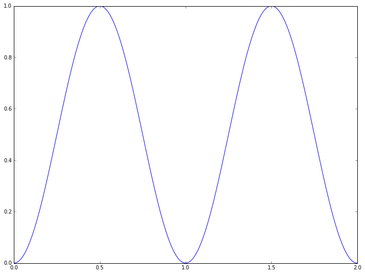
We have defined two sequences - in this case lists, but tuples would also work. One contains the  -axis coordinates, the other the data points to appear on the
  -axis. A basic plot is produced using the
 plot command of pyplot. However, this plot will not automatically appear on the screen, as after plotting the data you may wish to add additional information. Nothing will actually happen until you either save the figure to a file (using pyplot.savefig(<filename>)) or
explicitly ask for it to be displayed (with the show command). When the plot is displayed the program will typically pause until you dismiss the plot.
If using the notebook you can include the command %matplotlib inline or %matplotlib notebook before plotting to make the plots appear automatically inside the notebook. If code is included in a program which is run inside spyder through an IPython console, the figures may appear in the console automatically. Either way, it is good practice to always include the show command to explicitly display the plot.
This plotting interface is straightforward, but the results are not particularly nice. The following commands illustrate some of the ways of improving the plot:
[4]:
from math import sin, pi

x = []
y = []
for i in range(201):
    x_point = 0.01*i
    x.append(x_point)
    y.append(sin(pi*x_point)**2)

pyplot.plot(x, y, marker='+', markersize=8, linestyle=':',
            linewidth=3, color='b', label=r'$\sin^2(\pi x)$')
pyplot.legend(loc='lower right')
pyplot.xlabel(r'$x$')
pyplot.ylabel(r'$y$')
pyplot.title('A basic plot')
pyplot.show()
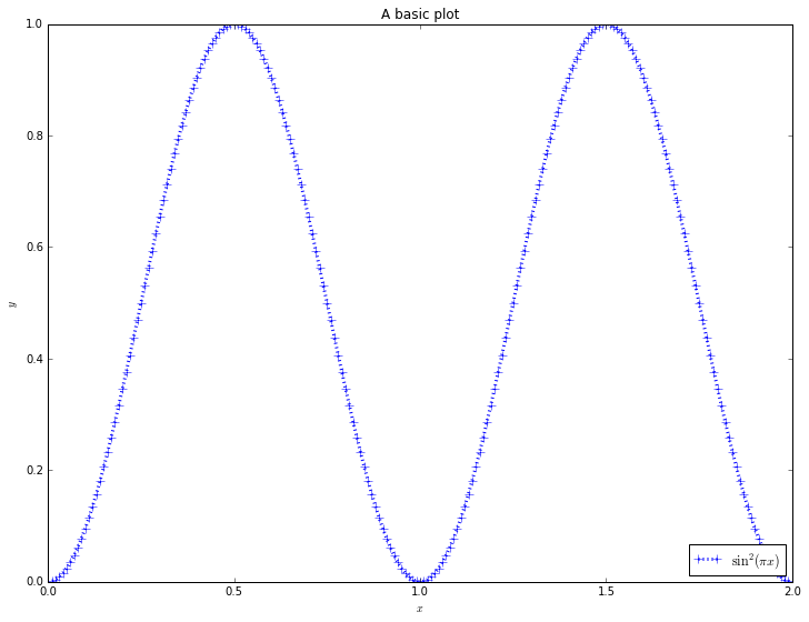
Whilst most of the commands are self-explanatory, a note should be made of the strings line r'$x$'. These strings are in LaTeX format, which is the standard typesetting method for professional-level mathematics. The $ symbols surround mathematics. The r before the definition of the string is Python notation, not LaTeX. It says that the following string will be “raw”: that backslash characters should be left alone. Then, special LaTeX commands have a backslash in front of them: here
we use \pi and \sin. Most basic symbols can be easily guessed (eg \theta or \int), but there are useful lists of symbols, and a reverse search site available. We can also use ^ to denote superscripts (used here), _ to denote subscripts, and use {} to group terms.
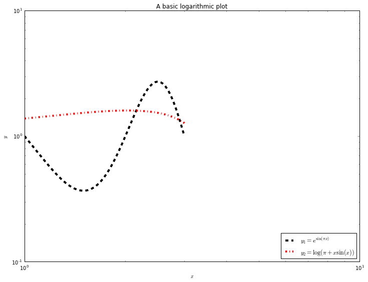
By combining these basic commands with other plotting types (semilogx and loglog, for example), most simple plots can be produced quickly.
Here are some more examples:
[5]:
from math import sin, pi, exp, log

x = []
y1 = []
y2 = []
for i in range(201):
    x_point = 1.0 + 0.01*i
    x.append(x_point)
    y1.append(exp(sin(pi*x_point)))
    y2.append(log(pi+x_point*sin(x_point)))

pyplot.loglog(x, y1, linestyle='--', linewidth=4,
              color='k', label=r'$y_1=e^{\sin(\pi x)}$')
pyplot.loglog(x, y2, linestyle='-.', linewidth=4,
              color='r', label=r'$y_2=\log(\pi+x\sin(x))$')
pyplot.legend(loc='lower right')
pyplot.xlabel(r'$x$')
pyplot.ylabel(r'$y$')
pyplot.title('A basic logarithmic plot')
pyplot.show()
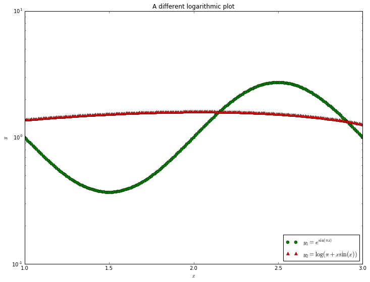
[6]:
from math import sin, pi, exp, log

x = []
y1 = []
y2 = []
for i in range(201):
    x_point = 1.0 + 0.01*i
    x.append(x_point)
    y1.append(exp(sin(pi*x_point)))
    y2.append(log(pi+x_point*sin(x_point)))

pyplot.semilogy(x, y1, linestyle='None', marker='o',
              color='g', label=r'$y_1=e^{\sin(\pi x)}$')
pyplot.semilogy(x, y2, linestyle='None', marker='^',
              color='r', label=r'$y_2=\log(\pi+x\sin(x))$')
pyplot.legend(loc='lower right')
pyplot.xlabel(r'$x$')
pyplot.ylabel(r'$y$')
pyplot.title('A different logarithmic plot')
pyplot.show()
We will look at more complex plots later, but the matplotlib documentation contains a lot of details, and the gallery contains a lot of examples that can be adapted to fit. There is also an extremely useful document as part of Johansson’s lectures on scientific Python, and an introduction by Nicolas Rougier.
Exercise: Logistic map
The logistic map builds a sequence of numbers  using the relation
where  .
.
Exercise 1
Write a program that calculates the first  members of the sequence, given as input
  and
and  (and, of course, ).
Exercise 2
Fix  . Calculate the first 2,000 members of the sequence for
  and
and  . Plot the last 100 members of the sequence in both cases.
What does this suggest about the long-term behaviour of the sequence?
Exercise 3
Fix  . For each value of between
  and
and  , in steps of
  , calculate the first 2,000 members of the sequence. Plot the last 1,000 members of the sequence on a plot where the -axis is the value of and the -axis is the values in the sequence. Do not plot lines - just plot markers (e.g., use the
 'k.' plotting style).
Exercise 4
For iterative maps such as the logistic map, one of three things can occur:
- The sequence settles down to a fixed point.
- The sequence rotates through a finite number of values. This is called a limit cycle.
- The sequence generates an infinite number of values. This is called deterministic chaos.
Using just your plot, or new plots from this data, work out approximate values of for which there is a transition from fixed points to limit cycles, from limit cycles of a given number of values to more values, and the transition to chaos.